“It’s not that green,” the woman says, and you don’t understand what she’s talking about because the dress is exactly green.
No, dear men, for you this is green and that is green, but – well – a little bit darker, but still green. Believe us, it’s not about women’s whims, but about that women can distinguish colors better than men!!
Special cells in the retina help us to distinguish colors. Some cells respond to red light, some to green, and the others to blue. But sometimes women have more cell types and can distinguish many times more shades than men.
“Normal vision” is hidden somewhere between these extremes but usually different people see color differently. And that’s why you can never describe in words exactly which shade a designer should use for your leaflet. The problem is even more complicated by the fact that both monitors and offset printing only imitate color, and not physically reproduce it. As a result, the perception of a green apple and the image of that apple on a screen will be absolutely different for different people. Add different paint materials and various monitor production technologies. Don’t forget about numerous color imitation algorithms. Sounds complicated? It is so.
Indeed, color is a complicated thing. It’s not for nothing that it’s a matter of interest for many research institutions and leading companies and that’s too long a conversation for one lunch. In this post, we wanted to say one thing: if the color of the printed product really matters to you, find something of that color and do a test print.
Interesting? Move on)

We found out that color on paper is imitation. How is this done?
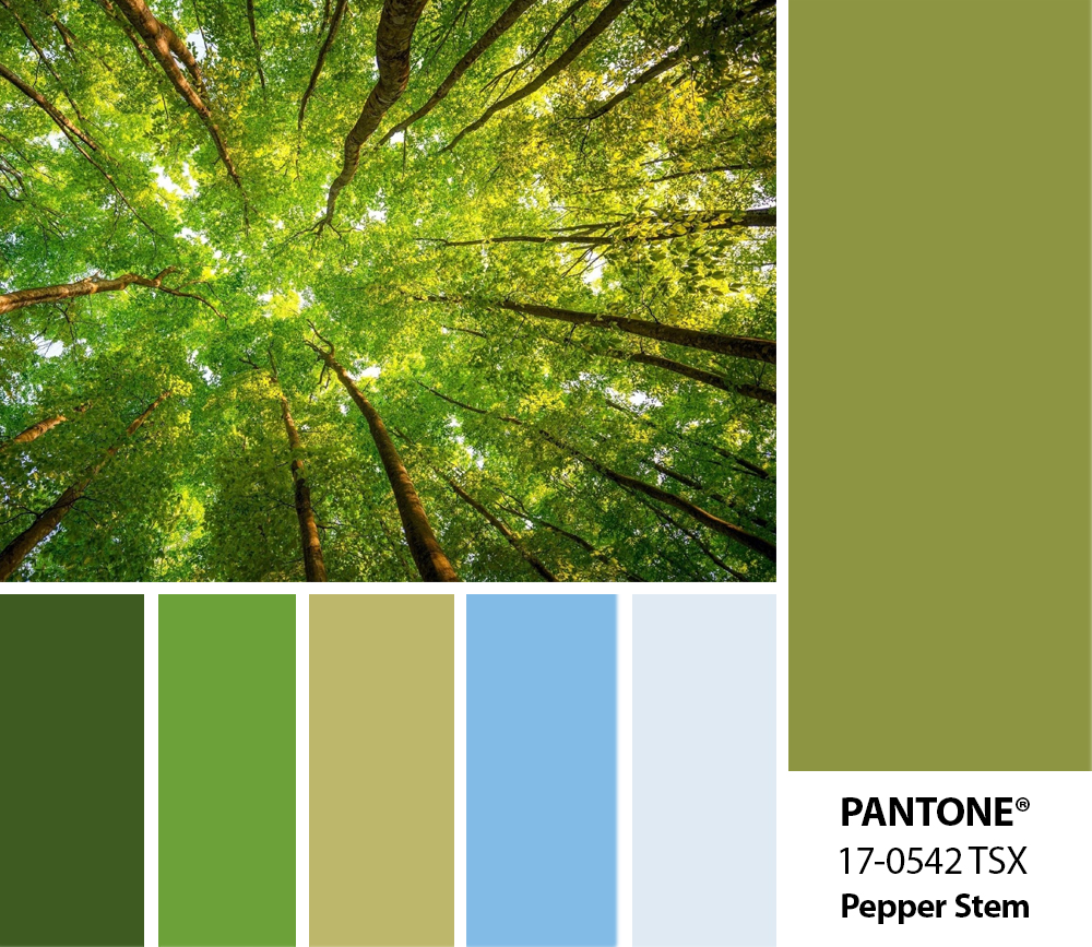
The sun emits various waves that make up, roughly speaking, white light – it is how our vision perceives it. If such light falls on a leaf of a tree, then this leaf ‘eats’ the red and blue portions, but reflects the green one. And this green wave hits our eyes. So we see exactly the green color of the leaf. Indeed, trees do not consume green light, but quite the opposite. A red apple reflects the red portion of the solar spectrum and absorbs the rest.
This is exactly how paints work on paper – green reflects the green portion of the spectrum, blue – the blue one, red – the red one. And what about black? The black one reflects nothing. The black spot ‘eats’ all the light. Of course, the white paper reflects the entire spectrum evenly. That’s why it’s white. However, we should note here that it’s extremely difficult for the paint to reflect the color. And the bluer the ray is, the more difficult it is to reflect it. That’s why you never see a truly blue sky in a travel brochure – paint simply cannot reflect the gentle blue waves. We face the same problem with the color of spring green or crazy red of fresh roses. The paint absorbs these colors, no matter how frustrating it is.
But how do shades appear on paper? Thanks to tiny colored dots – small stains of paint on paper. Four colors – Cyan, Magenta, Yellow, BlacK (CMYK) – create all the variety of offset printing. The eye does not distinguish between these tiny spots from a distance, so if space is filled with a mixture of purple and yellow dots, the eye will see red. The more paint, the more saturated the color, but the more rays this paint “eats”. As a result, offset printing cannot be rich in color and light at the same time. This can only be achieved by the designer playing in contrast.

Why Pantone?
Do you know that your corporate color may not be printed, no matter how hard the printer tries? Even more, any mistake in calculating the density of paint spots, or an error in applying paint, or even paper moisture can distort the color. It is to prevent this from happening Pantone colors exist. They are made in a special way so that the molecules of which they are composed reflect a certain portion of the spectrum. Such paints always reflect the same waves, i.e. they have a stable color.
Conclusion:
If you want your corporate color to be always the same, choose it from the Pantone palette and print your corporate products with this paint. If you want the logo to be reflected in different ways, choose a color for it that can be reproduced by the CMYK offset printing technology.